Most packaging conversations start with mood boards. Ours start with a dieline — the flat technical drawing of the pack with every fold, seal, and glue flap marked. Because until you know exactly how much printable surface you have and where it bends, every beautiful concept is a guess.
This is the process behind the InstaFresh house-brand range we designed — handwash pouches and pump bottles, dishwash gel, liquid detergent, fabric conditioner — a hygiene line that had to hold a supermarket shelf against national brands with ten times the marketing budget.
Start from the cutline, not the concept
A spout pouch curves. A pump bottle has a wrap-around label that meets itself. A dishwash gel label has a usable front panel smaller than a phone screen. Designing on a flat rectangle and then squeezing the result onto the pack is how brands end up with logos disappearing into seals and claims folding around corners.

So we reverse it: get the dieline from the converter first, mark the safe zones, and design inside the real geometry. The front panel hierarchy — brand, variant, promise, size — is placed where the pack actually faces the shopper, not where the artboard looks balanced.
A range is a system, not six labels
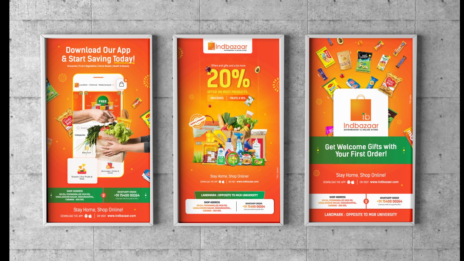
InstaFresh needed handwash, dishwash, detergent, and conditioner to read as one family at three metres and as distinct products at arm’s length. The system that does this is simple: one logo lockup and layout grid shared across the range, one dominant colour per category, and one consistent slot where the variant name always sits.
Once that grid exists, new SKUs stop being design projects and become fill-in-the-blanks exercises. The client can extend the range without the shelf drifting out of coherence — which is the real deliverable, more than any single pack.
Shoppers give a pack about two seconds. The system decides what those two seconds say.
Print is the medium. Respect it early.
- Design in CMYK from day one — that neon gradient will not survive the press.
- Keep small type above 6pt and never reversed out of a busy photo.
- Ask what substrate you are printing on; matte laminate and glossy film render the same file differently.
- Put barcodes, batch panels, and statutory text on the dieline first, not last.
- Get a physical proof before mass production. Screens lie about ink.
Mockups close the approval gap
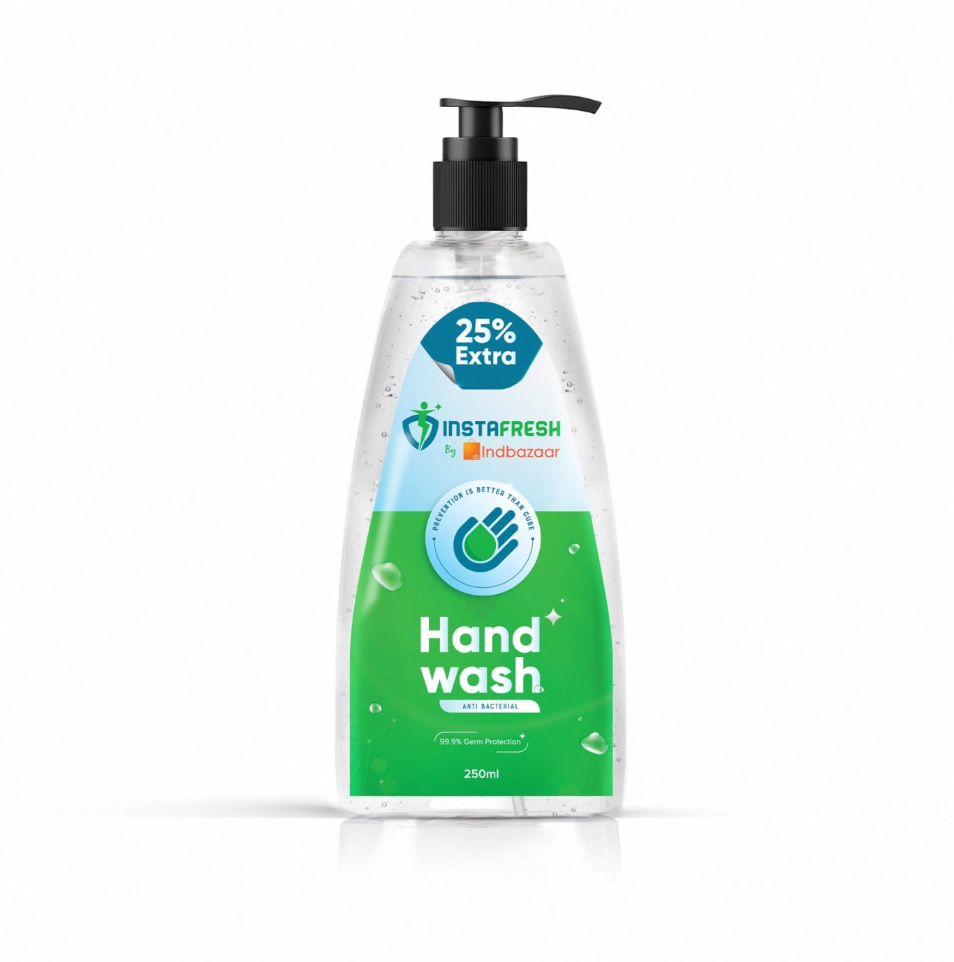
Clients cannot approve a flat label; they approve a pack they can imagine on their shelf. Every label in the range is applied to a 3-D render — pouch, bottle, box — before sign-off. It surfaces problems early (a seam splitting a headline, a claim hidden by the cap) and it kills the revision cycles that come from surprises at press.
The shelf test
The final review never happens on a white artboard. We line the range up next to photographs of the real competition, shrink it to thumbnail size, and check three things: can you find the brand, can you tell the variants apart, and does it still look like it costs what it costs. If a pack passes at thumbnail size, it will win at three metres.