01 — The brief
Collateral that matches the product.
Bloombyte had a modern product but dated leave-behinds. The brief was a compact collateral set — a brochure a sales team is happy to hand over and web banners that carry the same energy online.
Case study / Brand collateral / 2023
Bloombyte needed collateral that looked as current as its product — a printed brochure that opens cleanly and a web banner set that carries the same confident purple. We designed the brochure suite and digital banners as one small, tight system.


Overview
01 — The brief
Bloombyte had a modern product but dated leave-behinds. The brief was a compact collateral set — a brochure a sales team is happy to hand over and web banners that carry the same energy online.
02 — The work
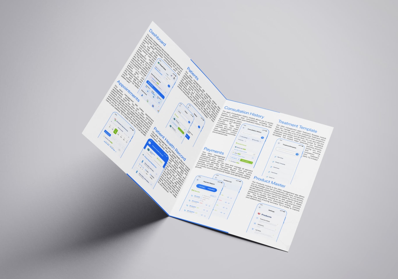
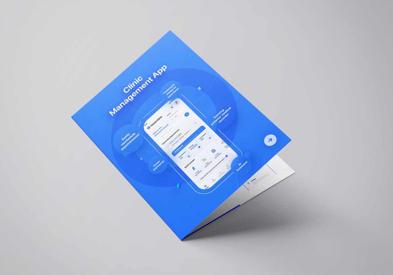
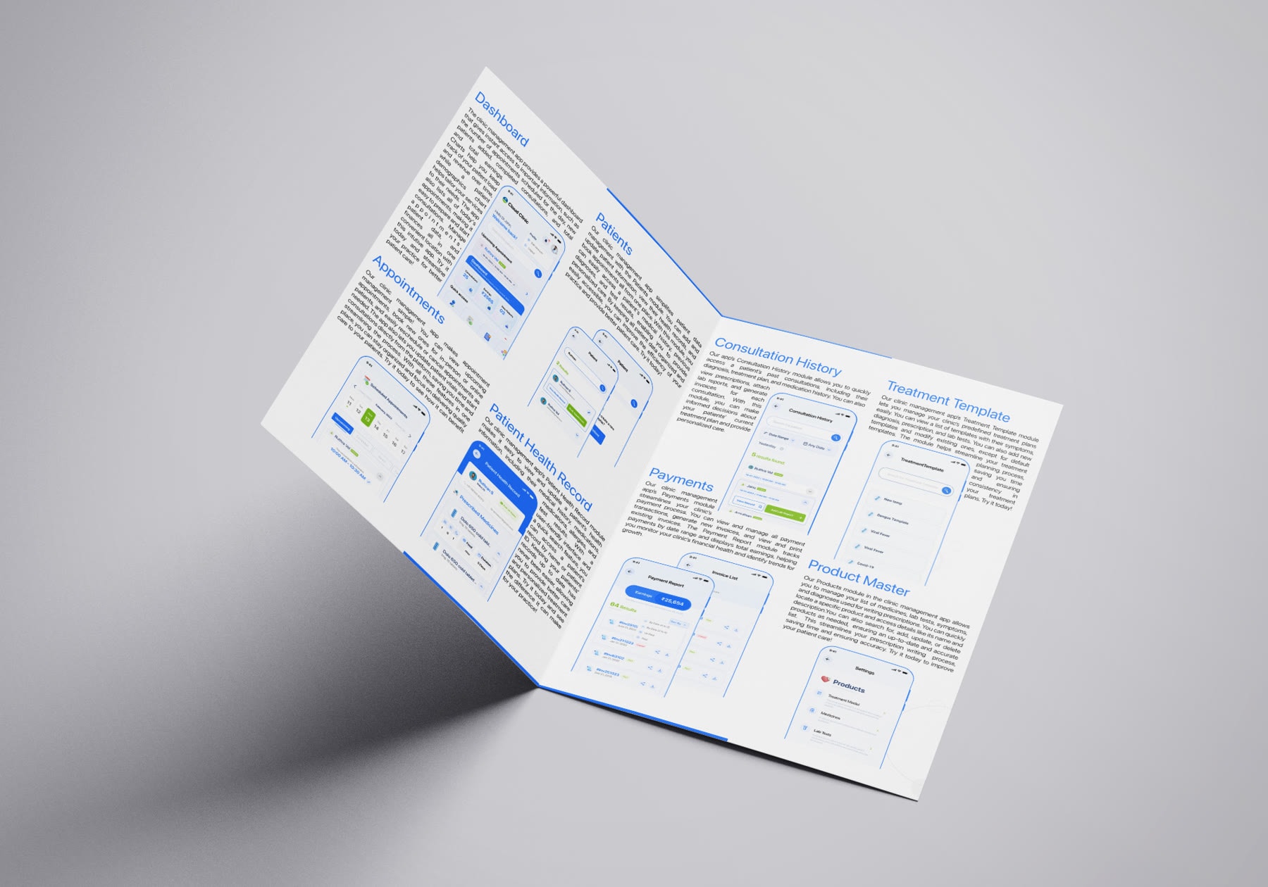
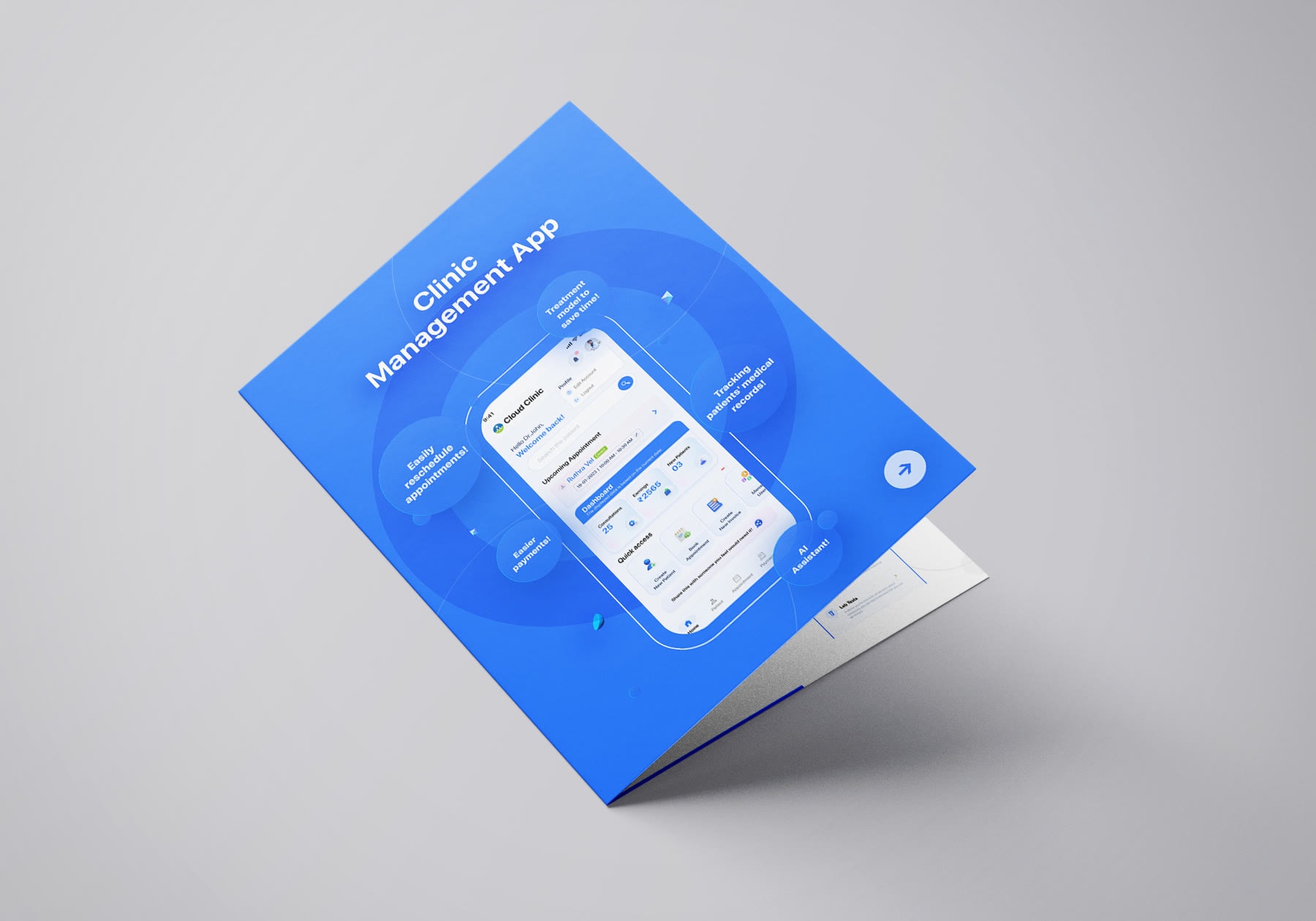
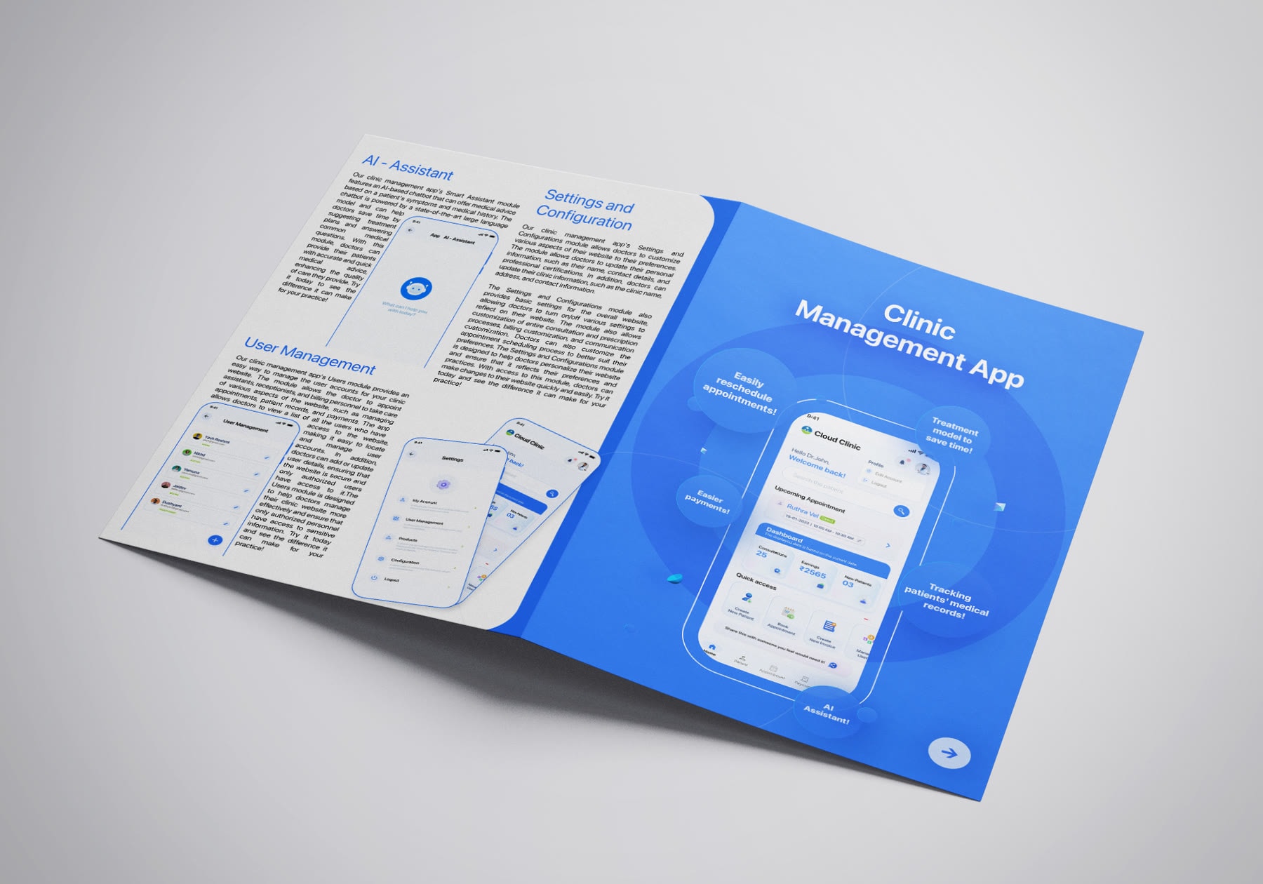
A tri-fold brochure — front, inner spread and fully-open layout — anchors on a confident purple and a clean grid, then extends into a cover banner and web banner so the brand holds from the printed page to the browser.
03 — The system
Every panel of the tri-fold sits on the same column grid, so the piece reads cleanly at each stage of opening — front, half-open, fully flat. The banners reuse that grid and type scale, which is why the set feels like one brand rather than five separate files.
04 — Colour
04 / The collateral


More work
Work with us
We design brochures, decks and banner sets as one system — a single grid, palette and type scale that holds from the printed page to the browser.
Tell us what your team hands over today and we’ll come back with a scope — no obligation, no template deck.

