Healthcare product design
Nursing Quality Dashboard
One digital system for thirteen nursing quality indicators—built for bedside entry, ward review, and hospital-level visibility.
- Client
- SMVMCH, Puducherry
- Scope
- UX · UI · Design system
- Platform
- Web dashboard, responsive

- 13
- Clinical modules
- 04
- Core workflow steps
- 01
- Shared product system
- 00
- Repeated patient fields
Clinical clarity without adding another burden to the ward.
The interface had to respect the pressure of nursing work: familiar actions, strong orientation, legible status, and no decorative complexity between the nurse and the record.
FindRecordReview
The three moves every one of the thirteen modules repeats, in the same order, on every screen.Paper forms captured quality data, but each worksheet introduced another pattern to remember and another set of patient details to write again.
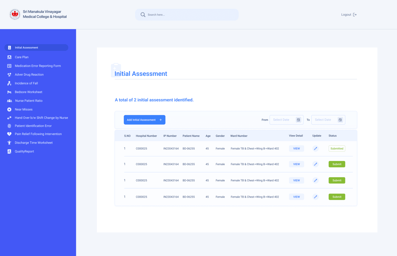
The digital system keeps the operating model consistent. Patient context is found once; navigation, status, save, and review stay fixed while only the clinical questions change.
That consistency is held by a design system—shared components, states, and rules—so a new indicator is assembled from parts that already exist rather than drawn from scratch.
| Aspect | On paper | In the system |
|---|---|---|
| Layouts | Thirteen worksheet formats | One page frame, thirteen question sets |
| Patient details | Rewritten on every form | Found once, carried through entry |
| Record status | Inferred from the paper file | Draft or submitted, stated on screen |
One product across the desk and the bedside.
Nursing quality work happens in two places: reviewing a list at the station and recording a case at the patient's side. The same interface handles both, so nothing has to be re-learned when a nurse picks up a tablet.


Different indicators. One unmistakable product language.
A short fall record, a repeatable medication table, and a multi-section adverse reaction form all use the same navigation, page frame, patient context, and status behaviour.
Complex records still deserve a calm frame.
Medicine details, reaction data, outcomes, and submission controls remain readable as one continuous clinical task.
One workflow nurses learn once and reuse everywhere.
The product reduces thirteen worksheets to four repeatable moments. Familiarity—not novelty—is the design feature that makes the system easier to use across wards.
- 01Find patient
Search once using the Hospital or IP number.
- 02Confirm context
Known patient details arrive inside the form.
- 03Record indicator
Only the clinical questions change by module.
- 04Submit & review
Draft and submitted states stay visible.
Five rules the interface is held to.
Every module was designed against the same short list. When a fourteenth indicator is added, these are the checks it has to pass before it ships to a ward.
- 01One frame, thirteen indicators
The navigation rail, the patient header and the status corner never move. Only the clinical questions change from one module to the next.
- 02Context is found once
The patient is searched for a single time. Those details are carried into every form rather than written out again on each one.
- 03Status is stated, not implied
Draft, required and submitted are written on the screen. A nurse never has to infer where a record stands from where it sits.
- 04Familiarity over novelty
A new indicator inherits the page that already exists. The thirteenth worksheet is learned in the first, not on its own terms.
- 05Nothing between the nurse and the record
No ornament competes with the clinical task. Each colour carries exactly one job, and anything without a job is removed.
Work with us
Still running a clinical workflow on paper?
We design healthcare and internal software the way this dashboard was designed—one frame, one workflow, and a system your team can extend to the fourteenth form without calling us back.
Tell us the workflow you want replaced and we’ll come back with a scope—no obligation, no template deck.