Over the past year we shipped two healthcare products back to back: My Medical Shop, a pharmacy app where families order medicines, book lab tests, and consult doctors; and Cloud Clinic, a management platform where clinic teams run patient records, appointments, and structured consultations.
One is consumer commerce, the other is a clinical tool. They should have taught us different lessons. Instead they taught us the same one, from two directions: in healthcare, trust is not a tone-of-voice exercise. It is built or destroyed by individual screens.
Clarity is the whole brand
When someone is ordering medicine for a sick parent, they are not in the mood for clever. Every screen in My Medical Shop got the same test: can a worried person, on a cheap phone, in a hurry, understand exactly what this costs, when it arrives, and what to do next. Playful microcopy lost to plain sentences everywhere the stakes were real.
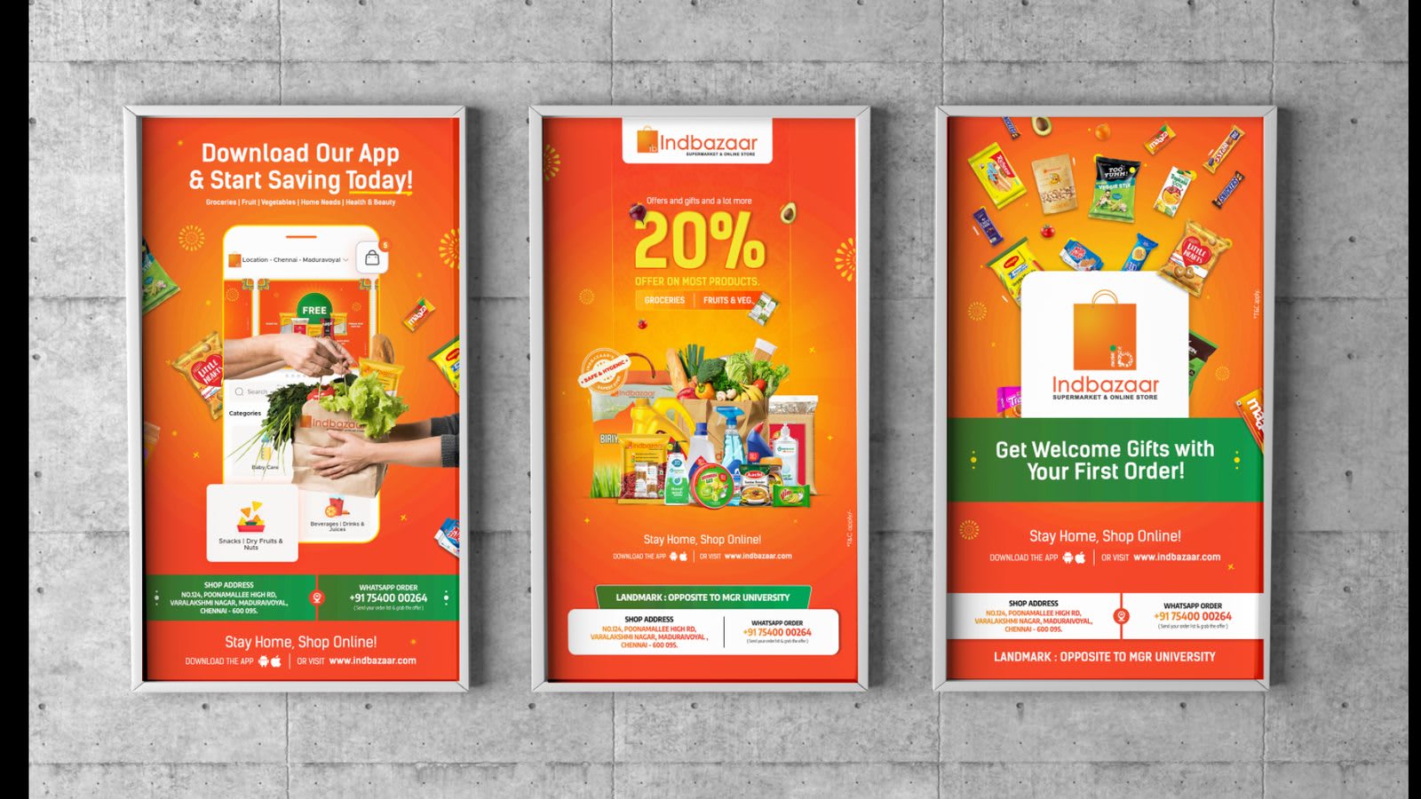
The commercial surprise is that clarity converted better too. Offer banners that said exactly what the discount was and which categories it covered outperformed the atmospheric ones every single time.
Error prevention is different when the cart contains medicine
- Prescription items are visibly separated from over-the-counter products — no ambiguity about what needs a doctor’s note.
- Dosage and pack size are repeated at checkout, where the mistake would actually happen, not just on the product page.
- Substitutes are offered with the generic name shown, so the choice is informed rather than just cheaper.
- Destructive actions — cancelling an order, clearing a cart — always state their consequence in the button itself.
In most apps a mis-tap costs a refund. In a pharmacy app it can cost a missed dose. You design differently once that sinks in.
Clinicians trust structure, not decoration
Cloud Clinic flipped the audience: the user is a doctor between patients or a receptionist with a queue at the desk. What earned their trust was structure — a consultation flow with the same sections in the same order every time, patient records where nothing important is ever more than one tap deep, and an appointment view built around the question they actually ask: who is next, and am I running late.
The most-appreciated design decision in the whole product was the least glamorous: consultation notes are structured fields, not a free-text box. Structure at the point of entry is what makes every later screen — history, referrals, prescriptions — reliable.
Design for the least comfortable user
Healthcare products have the widest user range of anything we design — from a 25-year-old ordering vitamins to a 70-year-old refilling heart medication. So the defaults are set by the least comfortable user: larger type as the baseline, one primary action per screen, high-contrast states, and phone numbers that are always visible because sometimes the most trustworthy interface is the option to call a human.
None of this is spectacular design. That is the point. In healthcare, spectacle reads as risk — and calm, legible, predictable screens read as care.